

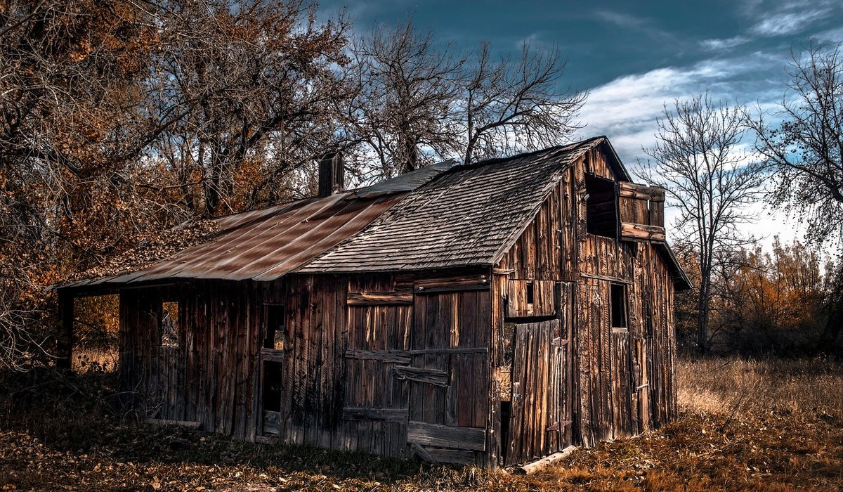
Cottage walls are rarely flat, rarely square and almost never bathed in even light. Thick cob or stone walls, deep window reveals and small-paned casements mean daylight arrives in narrow shafts and fades quickly across the room. Add low ceilings and exposed beams, and you have a space that behaves very differently from a modern box with a wide window.
That matters because colour is never seen in isolation. It is seen next to old timber, lime plaster, brick, flagstones and whatever light happens to be available. Stark whites and saturated modern shades tend to amplify the grey in a north-facing room, while colours drawn from earth pigments settle into the space and make the most of what light there is.
Before you choose anything, spend a week paying attention to your rooms. Which way do they face? Where does the sun land, and for how long? Does light bounce off pale stone outside or disappear into dark foliage? As a rough guide:
Be realistic, too: a north-facing hallway with no window will never read as white, no matter how many coats you apply. Choose a colour that looks good in shadow instead of fighting the architecture.
Traditional pigments were dug, burned or ground from what was locally available, which is why the classic cottage palette leans towards ochres, umbers and muted reds. You needn't replicate historic recipes, but you can borrow the logic. Colours mixed from earth pigments have a softness and depth that synthetic brights lack, and they sit comfortably beside timber and stone.
These shades also flatter imperfect surfaces. On hand-trowelled lime plaster, an earth pigment shifts subtly with the undulations of the wall, which is exactly what you want in an old building.
Pure brilliant white has a very high light reflectance value, which sounds helpful but often turns harsh and glaring in a small cottage room – and distinctly grey once the light drops. Broken whites, tinted with a drop of ochre, umber or a hint of red, are far kinder. Think chalk white, stone white, old linen and pale plaster rather than anything named "brilliant".
Keep ceilings and woodwork a shade or two apart from the walls. In a small, low-ceilinged room, a hard contrast between wall and cornice visually lowers the ceiling; a subtle difference gives definition without chopping the space about.
Greens and blues do belong in cottages – sage, duck egg, faded indigo, weathered grey-green – but keep them greyed and chalky rather than saturated. Bright cobalt or emerald will overpower small rooms and make old timber look orange by contrast. Muted greens work beautifully in kitchens with wooden dressers; soft blues and duck eggs suit bedrooms and bathrooms.
In dark or cramped rooms, avoid the single accent wall. Painting everything – walls, woodwork, even the ceiling – in one soft tone blurs the edges and makes the space feel larger. Save bolder earth reds for rooms that can take them.
Finish matters as much as hue. Modern vinyl matt can look flat and faintly plasticky in a period room. Chalk-based paints, limewash, distemper and clay paints have a softer, more breathable finish that suits old walls, and limewash is excellent on stone or brick where you want texture to show through. On woodwork, a low-sheen eggshell is practical and forgiving; reserve gloss for exterior doors and handrails.
Always test in situ. Paint a patch at least A3 size on two adjacent walls and live with it for several days, checking it in morning, afternoon and evening light, and beside the beams, floor and any fixed textiles. If a colour already feels strong after a week, it will feel stronger still once the whole room is done – go one step softer.
Old houses were decorated incrementally, and yours can be too. Allow a colour to settle before judging it, and don't be afraid to adjust joinery or ceilings a shade later. A cottage interior rarely needs one perfect palette; it needs colours that are gentle with the light, honest about the materials and pleasant to live with for years.

Rusticarch Written for people who value the details, and want honest guidance they can trust.

Rusticarch Written for people who value the details, and want honest guidance they can trust.

Permitted development rights, green belt restrictions and local design guides all affect rural extensions, so early advice can save time and money.

Comments
ALina Kelian
19th May 2018 ReplyRusticarch We spend our time finding what works so you don't have to, and sharing exactly what made the difference. ullamco laboris nisi ut aliquip ex ea commodo consequat.
Rlex Kelian
19th May 2018 ReplyRusticarch No rushing, no fuss — just thoughtful notes and practical help, written by people who care. ullamco laboris nisi ut aliquip commodo.
Roboto Alex
21th May 2018 ReplyRusticarch No rushing, no fuss — just thoughtful notes and practical help, written by people who care. ullamco laboris nisi ut aliquip ex ea commodo consequat.